March '26
Reporting, Built for How Your Quarter Actually Runs
You write OKRs at the start of the quarter, then the signal fragments. Updates sit in docs, Slack threads, and meetings. Leaders ask for status, teams scramble to summarise, and problems surface late. You lose time, accuracy, and trust in the data.
This release fixes that. The new Reporting view gives you a single, real-time picture of how your OKRs are progressing, with enough detail to act immediately. You can see what needs support, what deserves recognition, and where your system is drifting from best practice.
This is a core piece of an effective OKR platform. It turns scattered updates into a usable operating view.
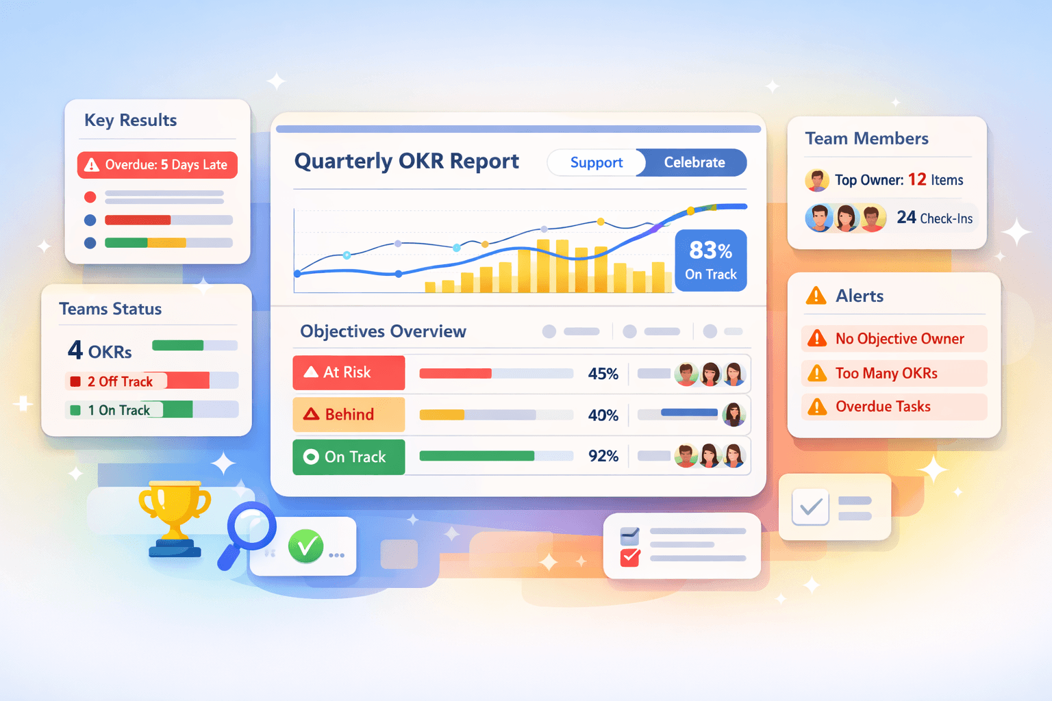
One page, full visibility
Open the Report and you see your entire Cycle in one place. Objectives, Key Results, Teams, and people all roll up into a single view. Everyone in your workspace can access it, so the same data drives every conversation.
Leaders get a clean pulse on progress without chasing updates. Teams see how their work connects to the whole. You remove the gap between “what we think is happening” and “what is actually happening.”
Support and Celebrate
At the top of the Report, switch between two modes.
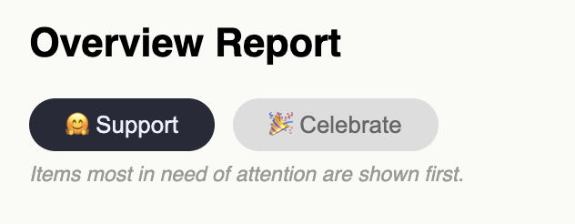
Support sorts items that need attention to the top. You see Objectives that are behind, Key Results that are overdue, and areas where progress is slipping. You can step in early, ask better questions, and unblock work before it stalls.
Celebrate flips the view. You see the strongest progress first. You can recognise teams, share wins, and reinforce the behaviours you want to see more of.
You move from reactive status reporting to active leadership.
Overall progress, grounded in real activity
The progress graph shows how your OKRs move over time across the Cycle. You see the combined progress line against your timeline, alongside daily Check-In volume.
You can switch to individual Objective lines to spot which Objectives drive progress and which ones drag. If one Objective stalls, you see it immediately. If activity drops, the graph shows it.
This connects progress to behaviour. If Check-Ins stop, your data degrades. If activity stays consistent, your reporting stays reliable. Learn why OKR scoring is a vanity metric.
Objectives breakdown that shows where to act
The Objectives table gives you a ranked view of performance.
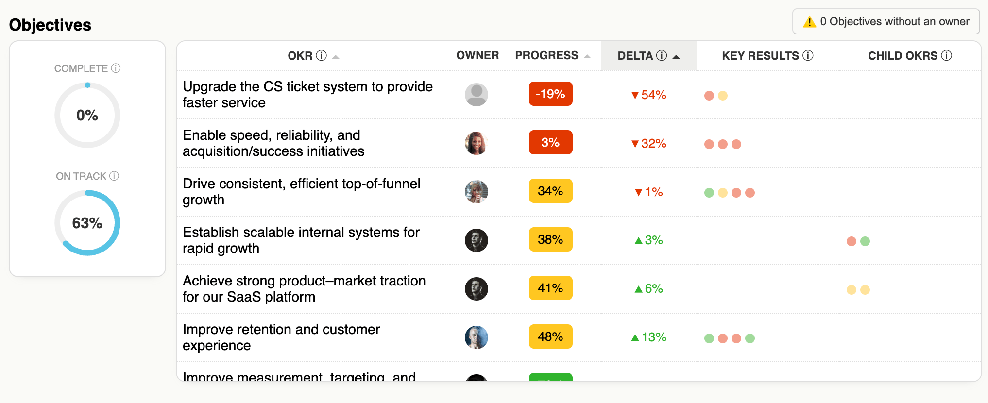
You see:
- Completion rate and how many Objectives are on track
- Delta between actual and expected progress
- Owners, progress bars, and visual indicators for Key Results and child OKRs
Each row tells a clear story. If an Objective is behind, you can see whether the issue sits in its Key Results or in contributing teams. You don’t need a meeting to diagnose it.
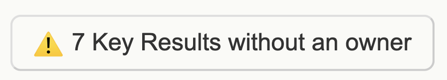
If an Objective has no owner, the Report flags it. You can assign ownership directly in the table with one click. You fix structural issues without leaving the page.
Key Results that stay current
Key Results get their own breakdown with one critical addition: freshness.
You see which Key Results are up to date and which ones are overdue for a Check-In. Overdue items show exactly how many days late they are, alongside the latest comment.
This addresses a common failure in OKR tracking software. If people don’t update regularly, the system becomes performative. The Report makes that visible, so you can enforce the habit that keeps your data useful.
You also see ownership gaps here, and you can fix them in place.
Teams that stay focused
The Teams table shows how each team performs across its OKRs.
You see:
- Number of OKRs per team
- Percentage done, on track, and off track
- Count of overdue Key Results
If a team carries too many OKRs, the Report flags it. This enforces a simple constraint: focus drives progress. When a team exceeds three Objectives, you see the risk immediately and can correct it.
This keeps your OKR system tight and outcome-driven, not bloated with low-impact goals.
People with clear, manageable ownership
The Team Members table shows how work distributes across individuals.
You see:
- Ownership count across Objectives and Key Results
- Total Check-Ins this Cycle
- Overdue items
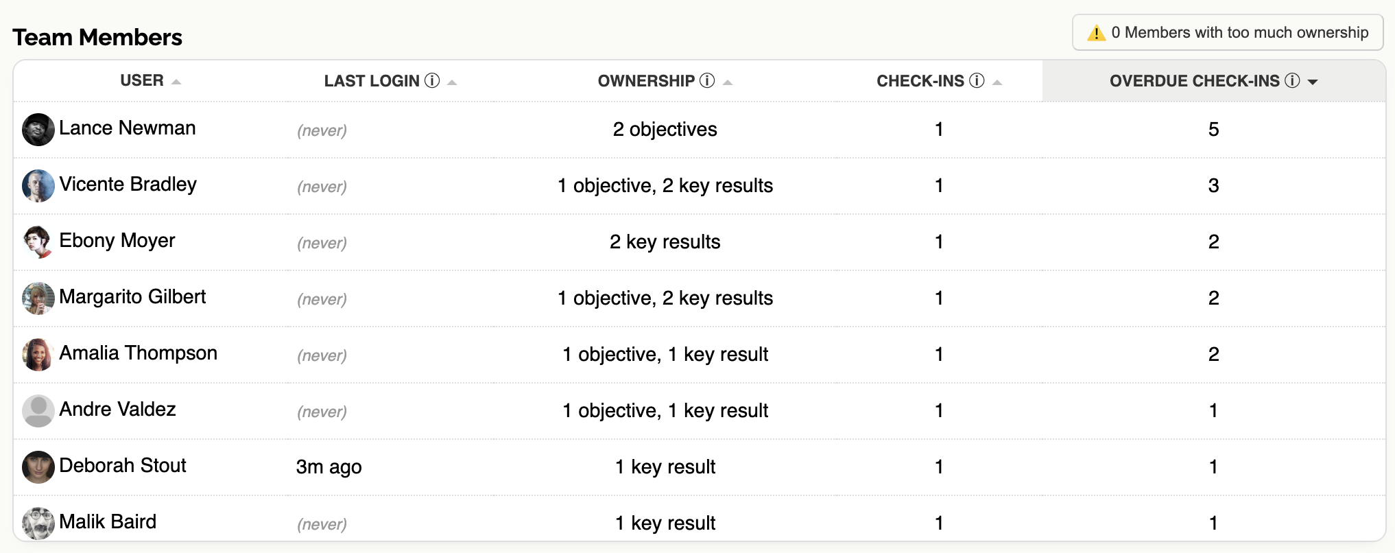
If someone owns too many items, the Report highlights it. You can rebalance before overload leads to missed updates and stalled work.
This keeps accountability clear and sustainable.
Built-in warnings that enforce best practice
Throughout the Report, you see targeted warnings:
- Objectives or Key Results without owners
- Teams with too many OKRs
- Individuals with excessive ownership
These are not passive indicators. They surface the exact issues that degrade OKR quality and execution. You can act on them directly in the Report, without navigating elsewhere.
How to use it
- Open the Report at the start of your weekly review
- Switch to Support mode and work top-down through the list
- Assign owners, chase overdue Check-Ins, and resolve blockers
- Switch to Celebrate mode and recognise strong progress
- Use the graph to check activity levels and momentum
- Scan warnings and fix structural issues on the spot
This takes minutes, and it replaces fragmented status meetings with a single, grounded conversation.
What this enables
You keep OKRs visible during the quarter, not just at planning. You give leaders a real-time view without extra reporting overhead. You enforce focus, ownership, and regular updates through the system itself.
This is what an OKR dashboard should do. It should not just display data, it should help you run the cycle.
If you are evaluating OKR software for startups or looking for a practical OKR management tool that holds up during execution, this release moves the needle.
Try it in your next cycle
Open the Reporting view and run your next check-in from it. You will see where to act within seconds, and your team will feel the difference in how you run the quarter.
Get started: Register or go straight to your Reporting view, or visit the Help section.