How To Make Strategy Visible Everywhere
Many organisations put a lot of effort into defining strategy. Leadership teams run planning sessions, define priorities, and translate them into Objectives and Key Results (OKRs).
Then something strange happens.
The strategy gets written down, maybe shared in a presentation, and then slowly fades from everyday work. Teams focus on urgent tasks. Meetings drift into operational details. A few months later someone asks, “How are we doing against our strategy?” and the answer requires pulling together slides, spreadsheets, and updates from across the business.
This problem is very common.
The issue usually isn’t the strategy itself. The problem is that the strategy isn’t visible enough to guide daily work.
OKRs are a way of implementing strategy. A way of turning the vision into reality. OKRs are the way that you execute your strategy. Your OKRs are the embodiment of your strategy, in essence.
To make OKRs effective, they need to be continuously visible across the organisation, not just discussed during planning.
This article explains how to do that in practice.
You’ll learn how to:
- Keep strategy and OKRs visible across teams
- Maintain OKR strategy alignment
- Create a clear map of how work connects to company goals
- Build simple views that show progress as it happens
Why Strategy Often Disappears After Planning
Many companies adopt OKRs because they want stronger alignment between strategy and execution.
But in practice several problems appear quickly.
First, alignment breaks down across teams. Different teams create OKRs independently, often without clearly linking them back to company objectives. There's no momentum.
Second, focus drifts away from OKRs over time. Teams focus on immediate work rather than the outcomes the strategy intended.
Third, organisations often create too many OKRs. When everything is a priority, nothing really is. And your strategy can't be, "do everything". AI-powered OKR suggestions help teams focus on fewer, more impactful goals.
Finally, leadership lacks visibility. Executives rely on summaries, meetings, or manually prepared reports to understand what’s happening, so they can't steer the ship.
These issues often have the same root cause.
The strategy is treated as a planning artefact, not a living system that guides work week to week.
And the ultimate consequence is always the same: the company doesn't make progress towards its goals.
The solution is to turn strategy into something that people can see and interact with continuously.
The Core Idea: The Execution of Strategy Should Be a Visible Map
Think about how teams work day to day.
People make decisions constantly:
- Which project should we prioritise?
- Which task matters most this week?
- Is this work actually helping achieve our goals?
When strategy is buried in documents, those decisions are made without context.
A better approach is to create a visible map of execution across the company.
This map should show:
- The company objectives (an expression of the nearmost strategic aims)
- The team OKRs that support them
- The relationships between goals
- The progress being made
When this map is visible to everyone, alignment improves naturally, people can quickly see how their work contributes to company goals, and everything goes faster in the right direction.
This is where a dedicated OKR platform or OKR tracking software becomes very helpful. Tools designed specifically for OKRs make it possible to maintain this visibility without a lot of manual effort. But you can do it without.
Let’s look at the practical steps.
Step 1 — Put All OKRs in One Shared System
The first step is simple but often overlooked.
All OKRs should live in one shared system that everyone can access.
In many organisations, OKRs end up scattered across:
- spreadsheets
- slide decks
- project tools
- documents
- Slack / chat
- team-specific trackers
This fragmentation makes OKR alignment across teams almost impossible. No one can easily see the whole picture.
Instead, OKRs should be stored in a single dedicated place that acts as the source of truth.
This has several important benefits:
Transparency
When all OKRs live in one place, anyone in the company can see them and ask questions to better understand or to validate that they're actually consistent with the strategy.
A product team can see the company objectives.
Marketing can see what sales is working toward.
Leadership can see how work connects across teams.
This transparency alone improves alignment.
Consistency
A shared system creates a consistent structure for OKRs.
Everyone follows the same format:
- Objectives describing the desired outcome
- Key Results defining measurable progress
- Regular updates tracking progress
This makes OKRs easier to understand across teams, and for everyone across the company to participate.
A Place Teams Return To
Perhaps most importantly, a shared system becomes a place people naturally return to.
When teams update progress, review goals, or prepare for weekly check-ins, they go back to the same platform.
This is a big part of keeping OKRs from becoming “set and forget”.
Platforms like OKR Dash are built specifically for goal tracking, make this straightforward. All company, department, and team OKRs live together in one environment where anyone can explore them.
Once everything is in the same place, the next step becomes possible.
Step 2 — Visualise Strategic Alignment
Having all OKRs in one system is helpful, but it still doesn’t guarantee alignment.
People also need to see how the goals connect, and how they relate to the strategy.
This is where visualisation becomes powerful.
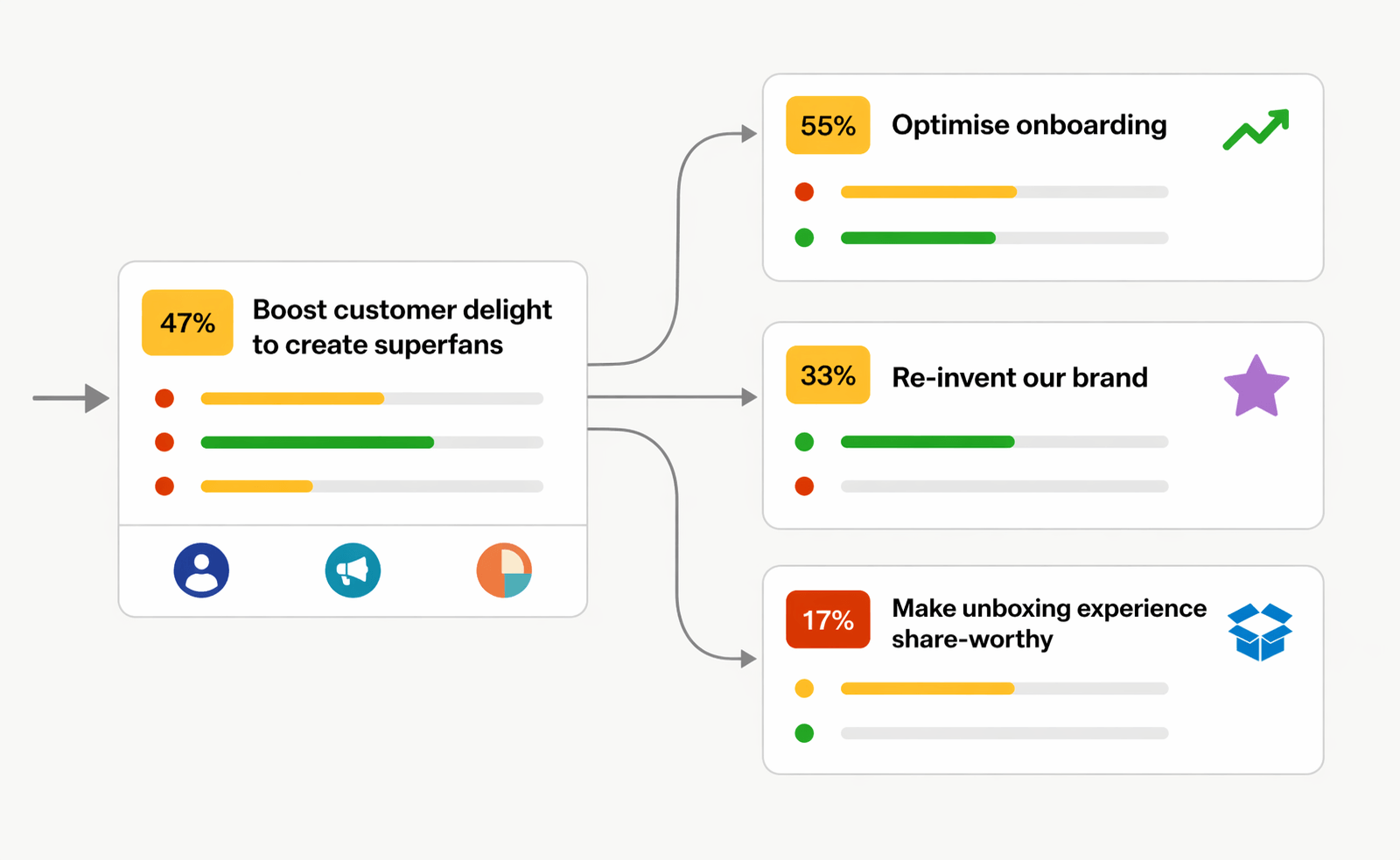
Instead of presenting OKRs as a flat list, you can show them as a structured hierarchy of work.
For example:
- Company strategic objective
- Department OKR
- Team OKR
- Department OKR
When displayed visually, this structure becomes a map of how your strategy is being executed on the ground.
In OKR Dash this concept appears through the "Alignment Map" (or Tree view). You could build a tree presentation in a tool like Miro but it would take way more time to update.
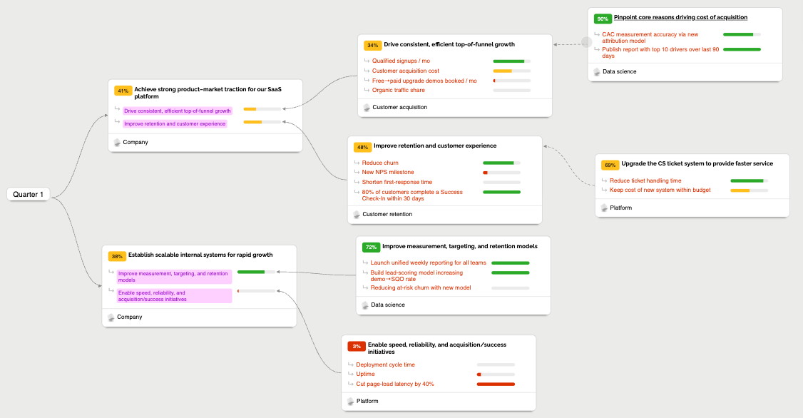
Tree View shows OKRs as a connected structure where each level supports the one above it.
When teams explore the Tree View they can quickly understand:
- Which strategic company goal they are contributing to
- Which team OKRs support that goal
- Whether there are gaps or overlaps between teams or departments
Now, nobody can do any work without seeing how it aligns to top level strategy. Nobody can claim they didn't know what the strategy was!
A few other common situations become obvious immediately.
Spotting Misaligned OKRs
Sometimes teams create OKRs that don’t clearly support company objectives.
In a flat spreadsheet this is hard to see.
In a visual structure, those OKRs stand out quickly.
Identifying Duplicate Efforts
Two teams might unknowingly work toward similar goals.
Seeing all OKRs in one alignment map helps reveal these overlaps.
Maintaining Focus
Tree View also highlights when organisations create too many OKRs.
If the structure becomes very wide or deep, it’s often a sign that priorities need tightening.
This visual approach makes OKRs much easier to discuss during planning and reviews.
Instead of debating abstract lists of goals, teams can look at the actual map of strategy execution.
Now all your OKRs are in the same place and everyone can see how they relate, you can move on to step 3.
Step 3 — Share Progress Far and Wide, with Everyone
Even with a clear strategy map, organisations still need an easy way to monitor progress.
Leaders, managers, and teams all need quick answers to questions like:
- Are we on track this quarter?
- Which objectives are at risk?
- Where should we focus attention?
Traditional reporting approaches usually involve manual slide decks or status reports.
These are slow to produce and quickly become outdated.
A better approach is to create live views of OKR progress.
Two types of views are especially useful.
OKR Dashboards
Dashboards show selected OKRs and their progress in a clear, visual layout.
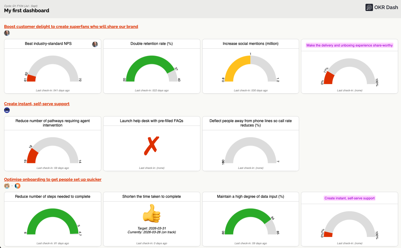
For example a dashboard might display:
- Company level OKRs
- All OKRs owned by a specific team
- Goals related to a particular initiative
Because dashboards update automatically, they provide real-time visibility into strategy execution.
They can also be shared widely.
Teams often display OKR dashboards on:
- large screens in offices
- internal portals
- leadership meetings
- quarterly reviews
This keeps goals and progress visible without requiring manual updates.
Presentation Views
Sometimes leadership needs a more detailed view suitable for sharing with larger audiences.
Presentation views solve this by showing OKRs in a simple format designed for:
- weekly check-ins
- strategy reviews
- company updates
- leadership meetings
Instead of rebuilding slides every time, teams can open a presentation view and show the live state of OKR progress.
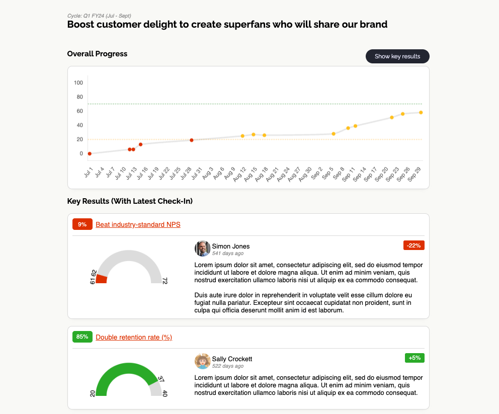
This saves time and ensures everyone is looking at the same information.
Together, dashboards and presentation views turn OKRs into a living reporting system rather than static analysis.
This is one of the most practical ways an OKR dashboard or OKR tracking dashboard helps organisations stay aligned.
What Happens When Strategy Becomes Visible
When these three practices are in place, something important changes.
Strategy stops being abstract. Instead, it becomes something people can see, explore, and update continuously. Several benefits appear quickly:
Alignment Improves Across Teams
Because everyone can see the full strategy map, teams naturally align their work with company priorities and with each other.
Leadership Gains Real Visibility
Executives can understand progress without relying on filtered summaries. They can see exactly how teams are contributing to company goals and how they're progressing.
Faster Intervention When Needed
When progress stalls or risks appear, they are visible earlier. Leaders can step in with targeted support instead of discovering problems late in the quarter. The Reporting view makes identifying these risks fast and visual.
OKRs Stay Part of Everyday Work
Perhaps most importantly, OKRs remain present in daily work, not just planning sessions.
People regularly check progress, update key results, and review how their work contributes to strategy.
This is the environment needed for OKRs to actually work well.
Bringing It All Together
Making strategy visible across the organisation doesn’t require complicated frameworks.
It requires three practical steps:
- Store all OKRs in one shared system
- Visualise alignment using Tree View
- Create simple views that show progress continuously
Together, these practices maintain OKR alignment across teams, keep strategy connected to everyday work, and give leadership the visibility they need.
Tools built specifically for OKRs make this much easier to achieve.
OKR Dash is designed around exactly these ideas.
It provides:
- A shared OKR platform where all goals live in one place
- Tree View alignment maps that show how work connects across the organisation
- Dashboards and presentation views that make progress visible to everyone
The result is a simple but powerful environment for OKR strategy alignment, OKR progress tracking, and clearer execution across the business.
Ready to Make Strategy Visible?
If your strategy currently disappears into documents, scattered updates, and manual reporting, it’s time to fix the system around it.
OKR Dash helps you put all your OKRs in one place, connect them clearly to company strategy, visualise alignment across teams, and share live progress through dashboards and presentation views.
That means:
- better OKR to strategy alignment
- stronger visibility across the company
- clearer focus on what matters most
- faster intervention when progress slips
- a successful OKR proces
If you want a better OKR system for making strategy visible and actionable across the entire company, register for OKR Dash and start building a clearer, more connected way to run your goals.
OKRs done right.
OKR Dash is a powerful tool for managing your OKRs.
No more siloed spreadsheets or manual tracking. One place to align teams and drive outcomes.