Check out what's coming up next, and what we've shipped recently (Last updated Jan 2026).
Roadmap
-

AI: Better OKRs, Less Effort
AI assistance helps teams create stronger OKRs by spotting gaps, overlaps, and weak signals. Over time, the system learns what good looks like for your organisation and raises the bar automatically.
-
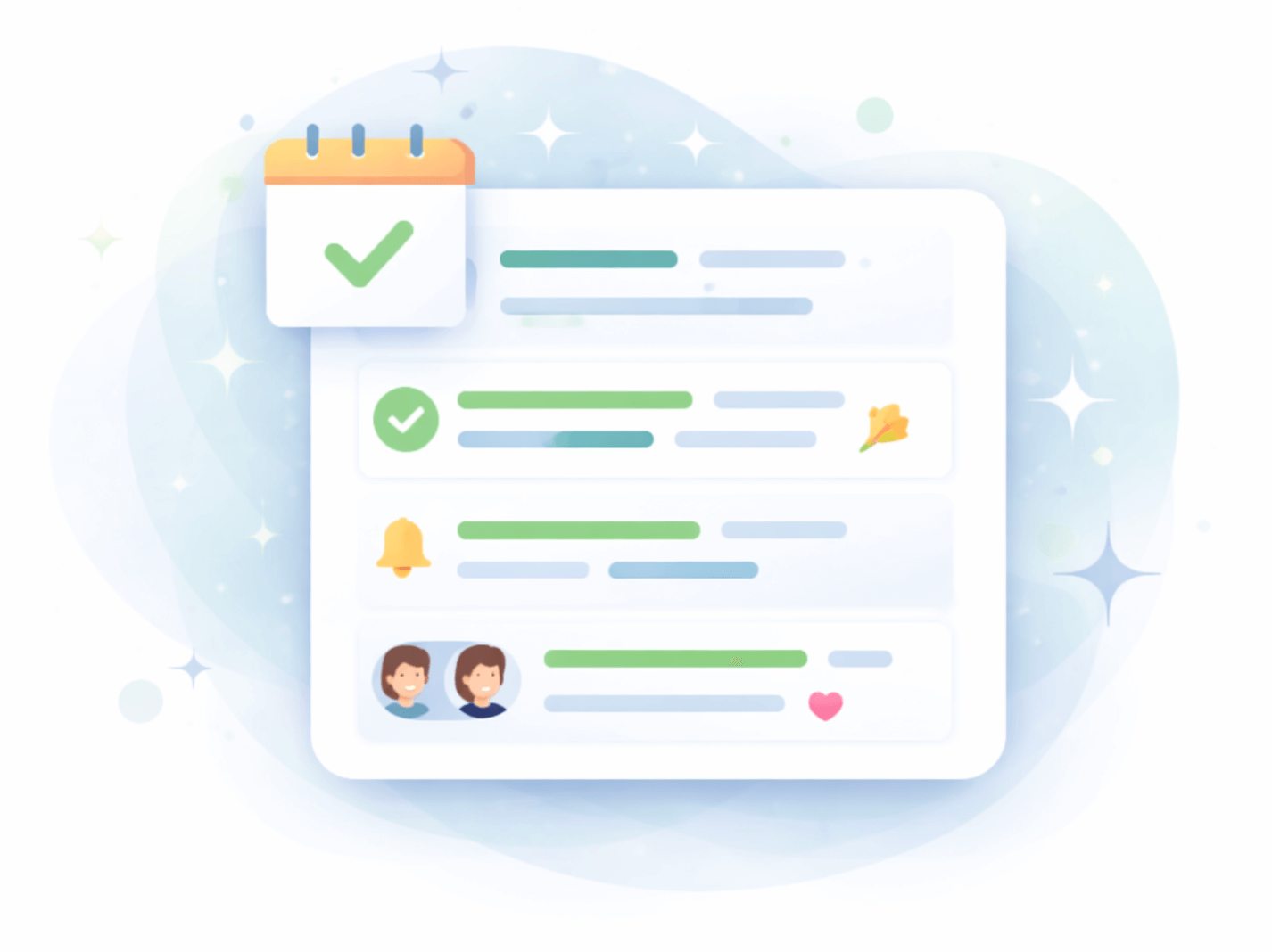
Hustle: Momentum Built In
Automated reminders, richer activity feeds, and conversational interactions keep OKRs front of mind. Reporting focuses on decision making and follow-through to keep momentum up, not vanity metrics.
-
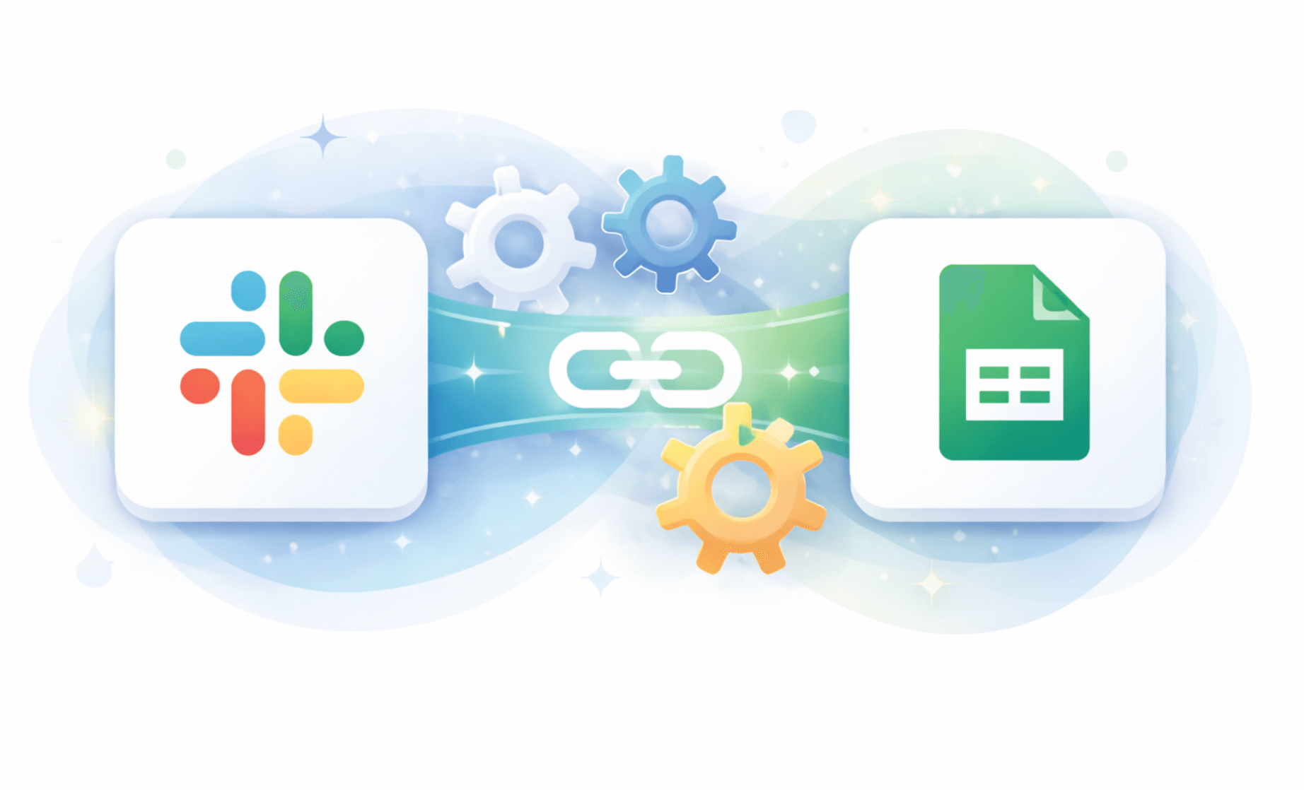
Integrations: OKRs Where Work Happens
Effective integrations bring OKRs into the tools teams already use. AI-powered weekly summaries surface what matters most, without requiring another dashboard.
Changelog
What we've released recently:
-
Feb 2026: Presentation View For Okrs
Presentation View makes it easy to share the live progress of any OKR with anyone. Generate a public link to a focused, visual view of an objective, showing real-time progress, key result trends, and the latest updates without requiring a login. Perfect for leadership reviews, stakeholder updates, and keeping everyone aligned around the work that matters.
-
Feb 2026: Custom Dashboards
Dashboards in OKR Dash just got a major upgrade. Instead of one giant view of all OKRs, you can now create focused dashboards that show exactly the work that matters — by team, person, project, or company level. Share them anywhere, even on big screen TVs, with no login required and maximise the visibility of the work.
-
Feb 2026: Okr Profile Page
The new OKR Profile Page gives every OKR a single place to see everything that’s happening around it. Rolled-up progress, individual KR progress, and all related check-ins are now visible in one clear view. No more hunting for updates — open the OKR and instantly understand how it’s really progressing. 🚀
-
Jan 2026: Check Ins And Reminders
Check-ins only work if people actually do them — and reminders are where most tools go wrong. This release introduces smarter notifications, a weekly summary email, and a dramatically easier check-in flow designed to build habits, not resistance. If check-ins feel like a chore today, this changes that.
-
Jan 2026: Ownership And Accountability
Ownership is one of the most important — and most misunderstood — parts of making OKRs work. This release introduces avatars for users and teams, plus clear single Owners for Objectives and Key Results, making accountability visible and human. If you’ve ever asked “who actually owns this?”, this one’s for you
-
Dec 2025: Visual Okr Alignment
We are excited to release visual OKR alignment in OKR Dash, giving teams a clear and intuitive way to see how work connects across the organisation. The new model supports real dependencies without forcing rigid cascades or misleading roll-ups. In this post, we share the thinking behind the change and how it helps teams move faster with confidence.
-
Oct 2025: Ux Design Overhaul
We have rolled out a full UX and design refresh for OKR Dash, focused on clarity, consistency, and professionalism. A new dark blue palette and refined dashboards make progress easier to read and actions easier to take. The result is a cleaner, more modern experience that stays out of the way of real work.
-
Apr 2025: Google Sign In
We have added Google sign-in to OKR Dash, making it faster and easier to get into your workspace without another password to remember. Sign in with a single click using your Google account and get straight to your OKRs. Available now for all users.
-
Oct 2024: Activity Feeds
We introduced Activity Feeds to give everyone a clear, real-time view of what is happening across the organisation. All OKR updates now flow into a single place, showing momentum, progress, and outcomes as they happen. It quickly becomes the homepage for anyone who wants to understand the pulse of the company.
-
Jul 2024: Teams And Cycles
Teams and Cycles were the first building blocks that let OKR Dash reflect how organisations actually work. By grouping people into teams and placing OKRs into real planning periods, ownership and timing became clear at a glance. This update laid the foundation for modelling work as it really happens.